Introduction
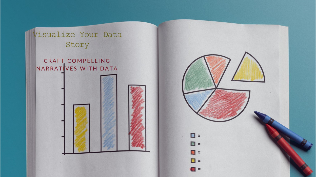
Data alone rarely drives decisions. Spreadsheets, dashboards, and reports can present accurate numbers, yet still fail to influence business outcomes. The gap lies not in the data itself, but in how it is communicated. Business stakeholders think in terms of goals, risks, opportunities, and trade-offs, not rows and columns. Storytelling with data bridges this gap by transforming analysis into a narrative that explains what is happening, why it matters, and what should be done next. When data is framed as a story, it becomes easier to understand, remember, and act upon.
Understanding the Stakeholder Perspective
Effective data storytelling begins with understanding the audience. Business stakeholders often have limited time and varied levels of technical expertise. They are primarily concerned with impact rather than methodology. A sales leader wants to know why revenue dipped in a region. A finance head wants clarity on cost drivers. An operations manager wants insight into process inefficiencies.
This perspective shapes how data should be presented. Instead of starting with charts, a strong story starts with the business question. What decision needs to be made? What problem needs to be solved? By anchoring the narrative to stakeholder priorities, analysts ensure that insights are relevant and focused. This mindset is often cultivated through structured learning experiences such as a business analysis course in pune, where translating analysis into business language is emphasised alongside technical skills.
Structuring a Data Story with Clear Flow
A compelling data story follows a logical structure. It typically begins with context, moves through insight, and ends with implication. Context sets the stage by explaining why the analysis was conducted. Insight highlights the key patterns or findings. Implication connects those findings to business decisions or actions.
For example, rather than presenting multiple charts at once, an analyst might guide stakeholders through a sequence. First, establish the baseline performance. Next, show where deviations occurred. Then, explain the drivers behind those deviations. Finally, outline the potential responses. This flow mirrors how people naturally process information and helps avoid confusion or misinterpretation.
Clear structure also prevents overloading stakeholders with unnecessary details. Supporting data can be kept in the background, while the main narrative focuses on the most important points.
Choosing the Right Visuals and Language
Visuals play a critical role in data storytelling, but only when chosen carefully. The goal of a chart is not to impress but to clarify. Simple visuals that highlight trends, comparisons, or outliers are often more effective than complex dashboards.
Equally important is the language used to explain the visuals. Technical terms and statistical jargon can create distance between the analyst and the audience. Plain, business-focused language keeps stakeholders engaged. Instead of saying a metric shows “high variance,” it may be more effective to explain that performance is inconsistent across regions.
Annotations, headlines, and callouts can further guide attention to what matters most. When visuals and language work together, the story becomes intuitive rather than analytical.
Connecting Insights to Decisions and Actions
A data story is incomplete if it ends with insight alone. Business stakeholders expect analysis to support decision making. This means clearly linking findings to potential actions, risks, or opportunities.
For instance, if customer churn is increasing in a specific segment, the story should explore possible reasons and suggest areas for intervention. If operational delays are affecting delivery times, the narrative should point to process bottlenecks and their impact on customer satisfaction or costs.
By framing insights in terms of choices and consequences, analysts help stakeholders move from understanding to action. This ability to translate insight into decision support is a core outcome of professional development paths such as a business analysis course in pune, where real-world scenarios are used to practise stakeholder communication.
Common Challenges and How to Overcome Them
One common challenge in data storytelling is the temptation to include everything. Analysts may fear that leaving out details reduces credibility. In reality, too much information often weakens the message. Prioritising clarity over completeness is essential.
Another challenge is confirmation bias. Analysts may unintentionally shape stories to support a preferred conclusion. Maintaining objectivity and presenting evidence transparently builds trust. It is also important to acknowledge uncertainty or limitations in the data, rather than oversimplifying complex issues.
Regular feedback from stakeholders helps refine storytelling approaches. Over time, analysts learn what level of detail and framing resonates best with different audiences.
Conclusion
Storytelling with data is a critical skill for influencing business decisions. By understanding stakeholder perspectives, structuring insights clearly, choosing effective visuals, and connecting findings to actions, analysts turn data into a strategic asset rather than a reporting exercise. When data is presented as a coherent story, it empowers stakeholders to make informed choices with confidence. In an environment where decisions must be made quickly and responsibly, the ability to tell meaningful stories with data is no longer optional, but essential.
